Meeple Station is an indie game by Vox Games, a small Australian SH that, in just over a year, has managed to bring its product from the Early Access to the definitive phase, through a constant and massive development path.
The game, I can say without fear of being exaggerated, is a clones di RimWorld, which inspires him enormously, especially as regards the social aspect of the Meeple. In short, a visual management system isometric, where the role of the player is to give orders in such a way that the small inhabitants of the space station can understand them, fulfilling them in the shortest possible time.
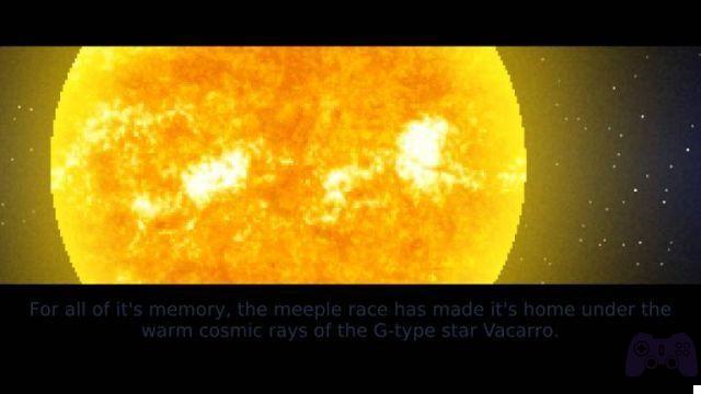
As we have already guessed, the core of the Meeple Station experience, which tries in vain enough to insert a very long narrative cue at the opening of the campaign, is to build a space base completely independent, capable of moving, trading with the outside world and traveling the cosmos in search of resources to accumulate.
Following in the footsteps of the giants
Historically, it is known, this particular genre of video game comes directly from the progenitor Dwarf Fortress, which represents a jumble of difficulties that are quite off the scale. Subsequent video games, thanks to hardcore users but up to a certain point, have begun to opt for more user friendly but no less complex solutions. Meeple Station in this does not offer who knows what differences, if not the nice possibility of moving the space base that hosts the Meeple around the map, with the aim of accumulating resources. In this sense, therefore, the game is even Simplified, as free of those natural and external elements that undoubtedly represent a challenge in competitors such as RimWorld or Gnomoria.
Il gameplay it is based on a double experience. The first is that of the construction of the base, or at least of its supporting structure. Clearly, and unlike other "terrestrial" experiences, no pseudo-human colony could think of surviving by building a base piece by piece in cosmic nothingness. There is therefore a need, in a similar way to Prison Architect, to prepare in advance, thanks to the available credits, an already self-sufficient space house. The parameters entered by the developers are heterogeneous and numerous: management of electricity, food, oxygen, waste and so on.
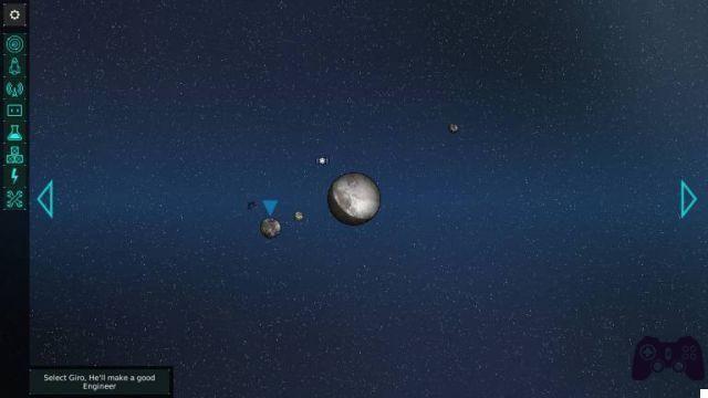
Each of these aspects is closely related to others (oxygen, vital for the inhabitants, who without starting to be less efficient until they die; the electricity needed to create turbines and so on). Meeple Station represents a game of balances, where every statistic and every aspect, if out of place, can lead to the complete collapse of the fragile extraterrestrial colony. In this sense I have undoubtedly found some solutions funny, especially as regards the exceptional number of objects and personalization available. The position of the base within the game world is also very interesting, which may seem conceptually difficult but which is rendered to perfection thanks to a layer quite intuitive.
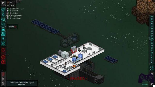
Much less usable instead it is the construction phase, or rather the assignment of tasks. Electricity, for example, relies on solar panels, batteries and, inexplicably, electrical wires. The latter must be connected to the rooms and to the solar panels, literally asking your builder to draw a connection for each square of the grid concerned. Of course, I understand the immersion, and I don't deny the beauty of the animation dedicated to the construction of the cables, but it is a really not very functional system: you almost never understand what is attached where, the engineers often forget about the sections. and the orders given do not have a clear feedback on the feasibility or otherwise of what is requested from Meeple.
A few too many defects
This is actually the point really sore of the whole production: the inability to immediately understand that something is wrong with our management. I'm not talking about a step-by-step guide or even visual pop-ups explaining the error, in the end this experience is based precisely on Do not mistake. In the same way, however, it is necessary for the game to indicate to the user whether something is impossible to obtain or not, while leaving the user with the task of understanding why. To these already evident problems is also added the management of the assignments (or jobs) of our beloved Meeple. There is no type of multitasking, not even the standard ones in order of preferences, which de facto forces the very few initial Meeples to constantly change tasks. Furthermore, even the assigned task soon turns out to be a pious illusion, with the AI of the puppets really unfit to life in space.

Technically I found the videogame pleasant and nice, thanks also to a very clean characterization of the structures. It is difficult for the player to have to understand what he is looking at inside his base. Less intuitive, however, it is the interface system. First of all, a pop up or an overlay is missing (and it is really a mystery) once the pointer is placed on a structure of the base. I believe that requiring this memory effort from the player is excessively burdensome, as well as unproductive.
Furthermore, the scrolling menu on the left of the game window is, without too many words, chaotic and unclear. Fortunately, the videogame experience, even if complex, it's not that hard, but it remains a minus not indifferent. In closing I also point out the presence of some bugs, too much, even if the software house must be acknowledged for being very present in solving the technical problems of the videogame.


